A case study where 300M Americans found critical health information 5x faster

HHS Logo

A case study where 300M Americans found critical health information 5x faster

Expectations for HHS.gov are high. Americans depend on this federal agency, the nation’s largest, for day-t0-day social and health information.  When new feedback loops hinted that the site was significantly failing to meet user’s top tasks, my team needed a strategy to systemically improve content findability.


My role in this story was as the Director of CX at WebFirst, a federal contractor for software development. As the Practice Director, I partnered directly with the Contract Officer and Program Manager for HHS.gov to set site strategies, guide and approve the site roadmap, and prioritize initiatives. Internally, I creatively directed and guided the HHS.gov design team’s activities and ensured designs met both internal and government design standards.

Research insights


HHS site visitors were unable to locate the health and services information they were looking for.
 
The site’s intercept-survey showed only 13% believed they found their target info, while over a quarter (27%) said they were unsuccessful. And a whopping 37% were unsure and didn’t know if they found or didn’t find it.
 
Visitors only visited 1-2 pages when coming to the HHS site. For a site with over 10k pages of information, this statistic shows the site fails in delivering the information users need.
 
Of the 25 most viewed pages, 19 were buried 4-6 clicks away from top-level navigation. 
 
Our hypothesis: the site’s limited number of main categories offers too few paths for reaching the depth of content housed deep within the site.

Prototyping


We had known the site  needed a new site navigation overhaul, yet the analytics data fueled our team’s ability to develop and propose a new navigation scheme. 


Old Design

The site’s existing navigation relied on pages as menus. Four main links were on the homepage:

Screen of HHS.gov HomepageLimited 4-option navigation on the Homepage


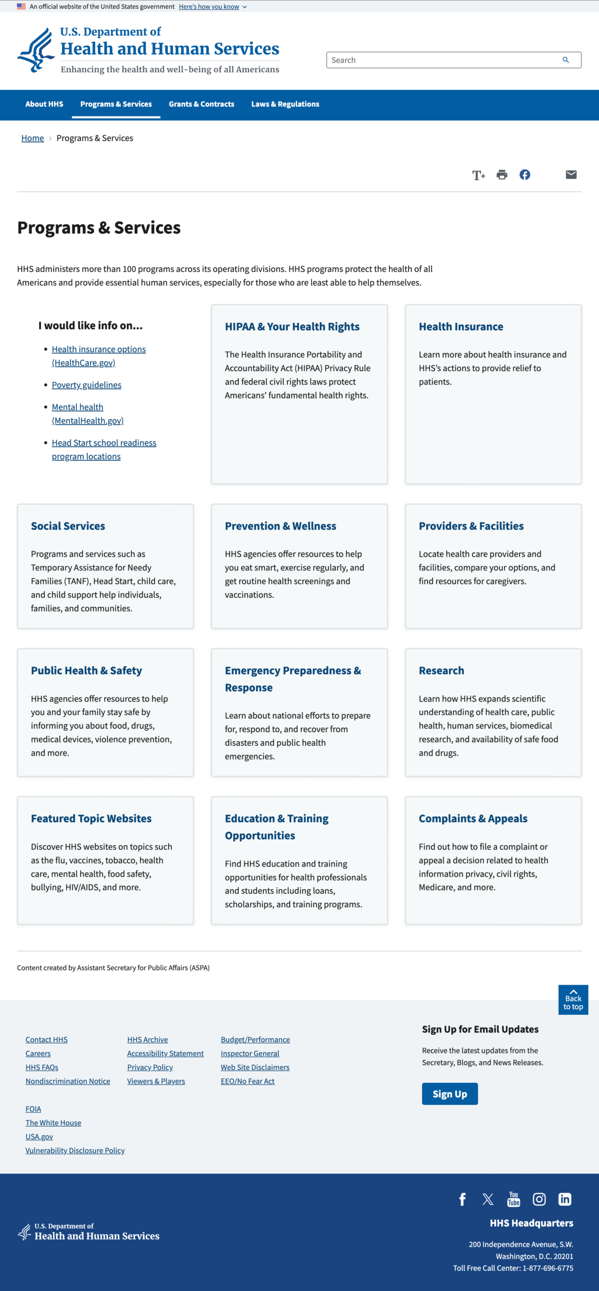
Landing page used solely for navigation menu


New Design

The new design had three primary hallmarks:

1. 

A mega menu structure

Using the top task methodology, we reorganized the site’s content according to topic. This resulted in a much shallower site structure that could be supported in a mega-menu scheme. Users could now preview their secondary options against the breadth of options and make more confident choices. 

2. 

Updated menu labels

Applying the US government’s Plain Language guidelines, we rewrote menu labels to clearly align with user tasks.

3. 

Removed side navigation

Within the new megamenu context, the existing side navigation on interior pages, became redundant.

New HHS Homepage Wireframe

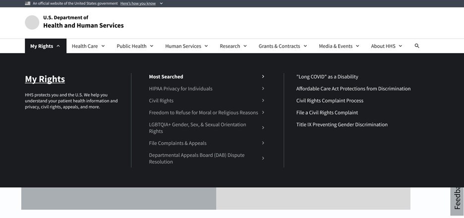
Screenshot: Megamenu image from study prototype 

Testing


Establishing a Benchmark

Our first user study was needed to set a baseline against.  I knew we would need to demonstrate that the new navigation design would outperform the old –and be able to communicate the magnitude of the anticipated change. I directed our UX Researcher to structure a top-task benchmark study to learn the time users were spending trying to find their target content on the current site. 


Measuring the New Navigation’s Performance 

A second round of user testing followed the same top-task structure within the new navigation scheme. Results showed that users reached their target content at least 5x faster using the topic-based megamenu redesign. The study showed that users:


Found how to file a HIPAA complaint in an average of 33 seconds. This was 5x faster than the almost 3 minutes it took the same customers to find the information using the former navigation.


Located guidance on how to participate in a clinical trial in an average of 57 seconds. This was 7x faster than the almost 7 minutes it took the same customers to find the information using the former navigation.

Outcomes


It was clear the new navigation design would be significantly more successful helping HHS visitors find the information they need. Especially in the context of this agency’s services, Americans deserve to receive the level of servicing they expect from their day-to-day use of consumer digital services. 

Once I had the new design’s performance metrics from the user study, I presented the findings to HHS decision makers.  Along with the metrics, I spoke to the overall user experience benefits of the megamenu:

The mega menu displays the same across the website and unifies the sites sub agency pages through visual consistency.

Easier inter-section navigation increased engagement time on the website

The megamenu enables visitors to see the breadth of the site’s offerings. With this transparency, we could expect to earn more trust with users and increase perceptions of reliability.

The redesign is currently being staged for launch on HHS.gov. The November 2024 US Election impacted the timeframes for its launch, yet it remains on the 2025 site roadmap.