Truist Bank launched in three separate “go live” events that ultimately absorbed the former BB&T and SunTrust banks. The staggered launch plan minimized risks on the core banking systems side, yet caused massive funnel disruptions to users’ experiences on the outgoing BB&T.com and SunTrust.com sites.
For one of my platform teams, the Public Sites platform, it meant shopping funnels were going to ‘break’ when prospective clients shopped outgoing products and wanted to open new accounts. Stakeholders hadn’t accounted for potential decreases to account opening revenue streams and pressure was on to find creative solutions to path prospects to new products, on a new brand platform, while minimizing fallout and revenue loss.
My role in this story was as the Sr. Director II of the Public Sites (aka “Storefront”) platform. Due to the emergency timeframe, my subject matter expertise across mutliple platforms, and the high risk for revenue loss, I took on the Lead Designer tasks. As a Sr. Director, I could approve quick-turn A/B user testing that was called for due to the sensitivity of the challenge. I knew I needed to quickly generate and validate the best pathing, especially to respond to the Development Director’s concerns around accommodating for unplanned work.
Research Insights
Existing SunTrust.com and BB&T clients were satisfied – even pleased overall – with their current banks and products. They had not expected nor asked for changes and were apprehensive (at best) about the new Truist bank and brand.
Truist bank was still an “unknown” and lacked the credibility of its predecessors.
The perceived scale of the new Truist bank as a new “big bank” scared current regional banking customers.
Prototyping
I created two unique user flow approaches to determine best handling for 1) interrupting the user-expected flow; 2) re-orienting users into a new flow; and 3) retaining and supporting the handoff for account creation.
Both outgoing banking sites already carried an Alert banner with messaging that the respective bank would “soon become Truist.”
SunTrust Homepage pre Truist.com launch
Prototype A – “Low Touch”
This solution only communicated the inability to open a new account when a user clicked any “Open Now” button. Then, a pop-up communicated 1) The product would soon no longer be available; 2) Why the product is no longer available; 3) Instructions to click through to Truist.com to explore new product options.
Prototype B – “High Touch”
More cues, positioned with pre-emptive timing.
1.
Outgoing banks’ Product Landing and Detail pages were updated to include a mid-page Alert banner just above the ‘Open Account’ CTA.
[Unfortunately, I’m lacking a screenshot of this page state.]
The Alert communicated that the products would soon be discontinued.
2.
An initial pop-up intercepted and routed new vs. existing clients.
Pop Up Window with two path options
Clicking any “Open Now” button would open a pop-up that asked users whether they were existing or new clients. Depending on response, users would see a second state with appropriate communication: to continue on with their existing logins or directed to the Truist.com Product Page(s).
3.
A second pop-up transparently communicated the merger-caused need to re-route to Truist.com.
Pop Up Window describing merger context and directing to next steps
4.
Visitors ultimately land on the Truist Checking Products Page and can view and compare the new product lines.
Truist Product Landing Page (top/partial view)
Complete view of Truist Product Page
Testing
When it comes to the funnel, risks to revenue, and the intrinsic hesitancy to introduce more screens in the onboarding flow, user testing results could never have been more crucial to making the best business decision.
Three user flow patterns were tested to determine best handling for 1) interrupting the user-expected flow; 2) re-orienting users into a new flow; and 3) retaining and supporting the handoff for account creation.
The ideal solution would minimize required changes to the outgoing sites’ product pages. The lightest dev touch would involve a pop-up window transition.
The sequence of pop-up’s triggered immediate dropout. The amount of text was overwhelming and transition was too jarring. There was simply too much context-change and explanation to accomplish in one spot.
Our team had predicted this outcome, and tested a second approach that used system of Alert banners on both the outgoing banks and the new Truist.com’s product pages, along with a pop-up.
Banking customers needed the layered and reassuring communications across the transition space to convey legitimacy, care, and build enough trust to follow the new shopping and onboarding paths.
Outcomes
The end solution created a multi-platform ‘net’ to support two user groups: both existing and prospective clients who wanted to shop for and open a new bank account.
For such a critical time as a merger, where disruptions to user flows for acquisition were imminent, the extra work required on outgoing site pages, and bespoke handling for user groups, was necessary. All eyes were on the funnel numbers in the 45 day run-up to the BB&T and SunTrust sites’ de-commissioning.
It was a huge business relief and recognized design ‘win’ when funnel numbers showed no fluctuation (up or down) within the merger transition window. For my leadership and hands-on contributions during this and the entirety of merger events, I received recognition from Executive Leadership.


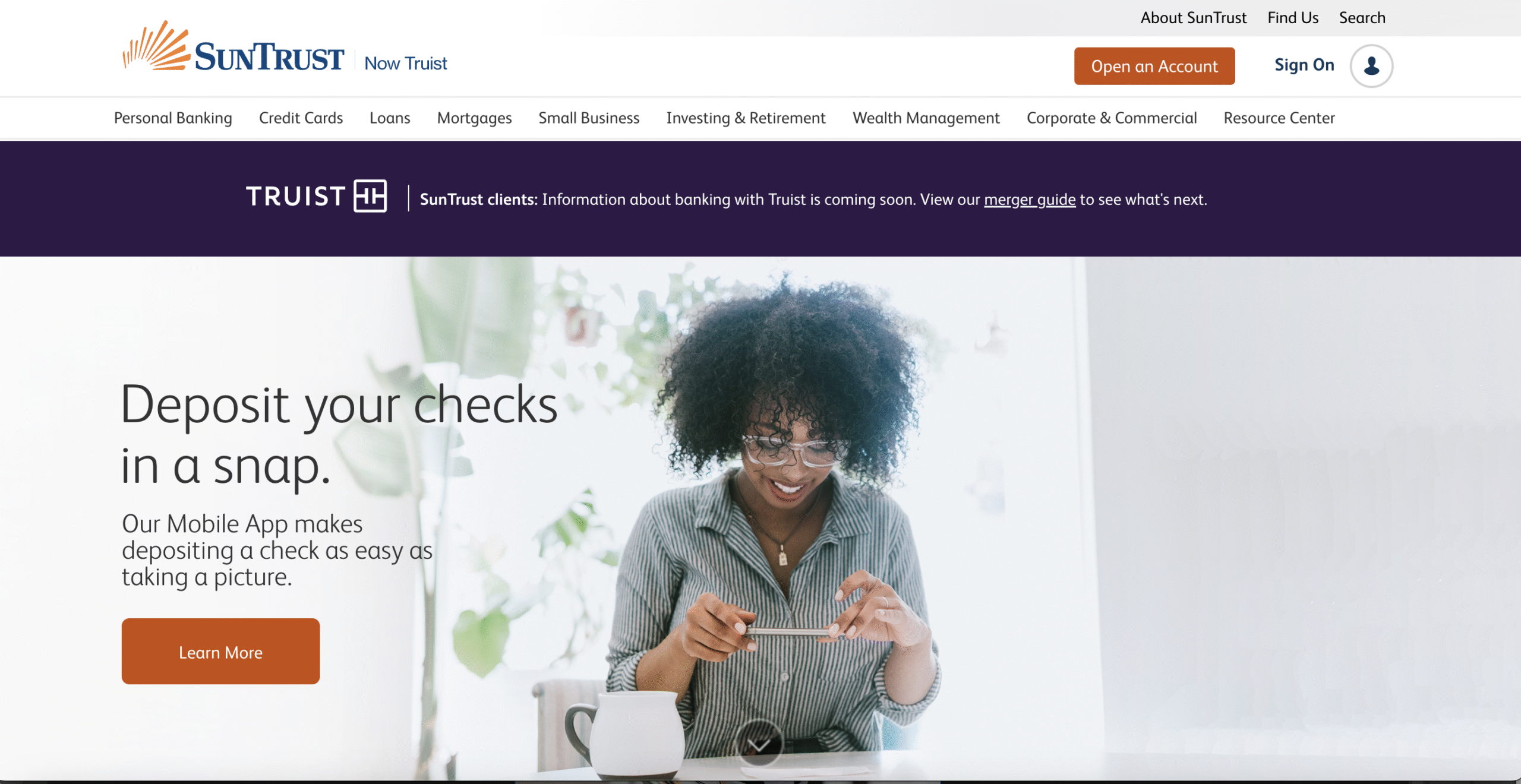 SunTrust Homepage pre Truist.com launch
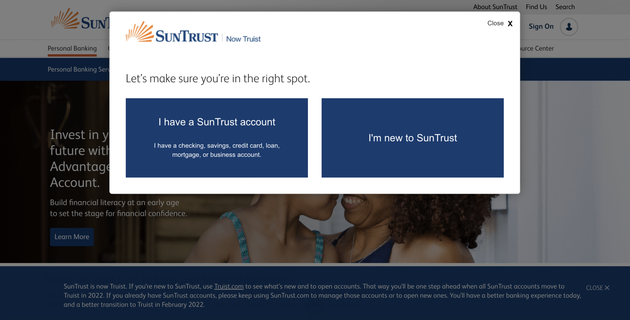 Pop Up Window with two path options
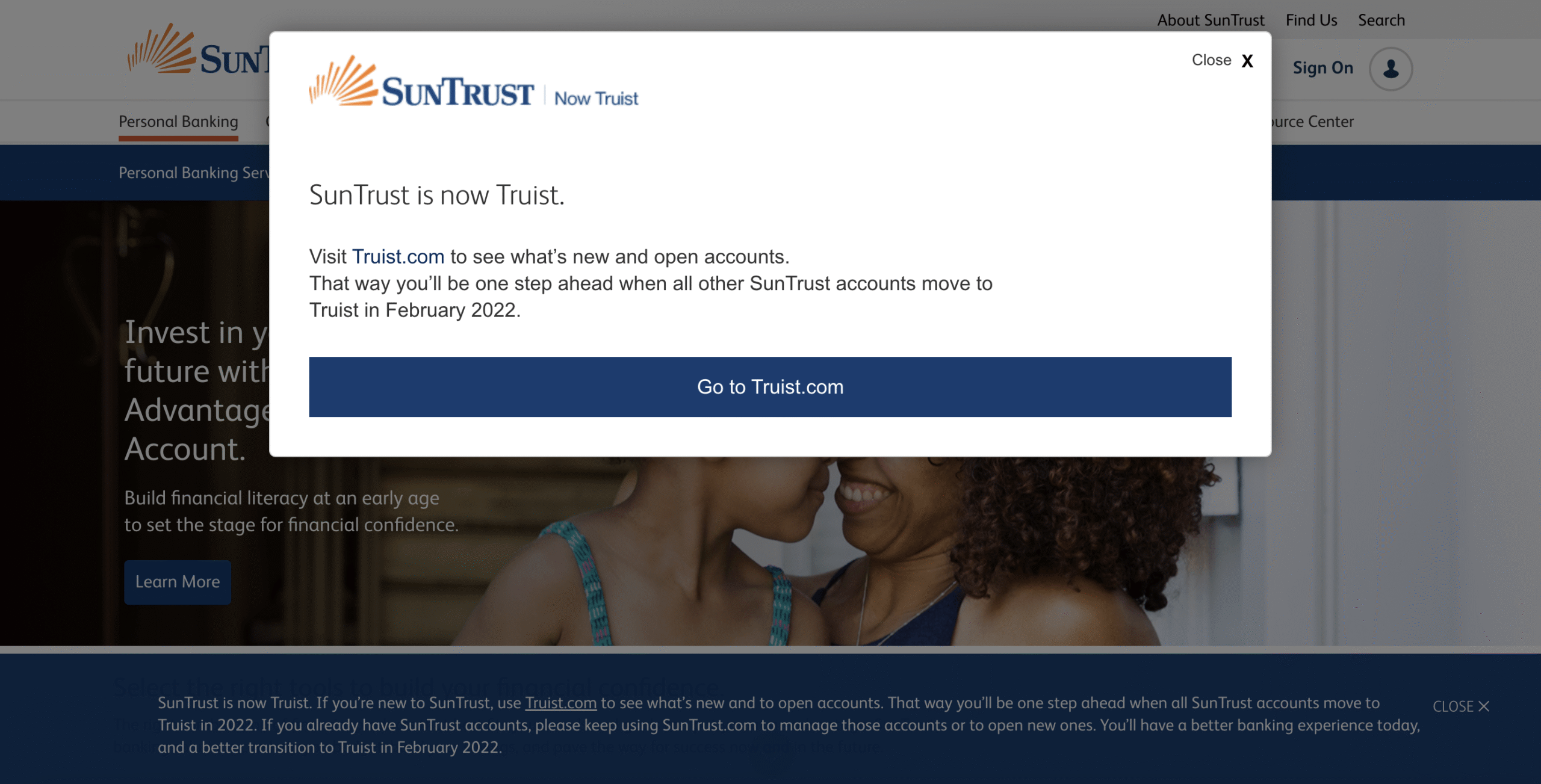 Pop Up Window describing merger context and directing to next steps
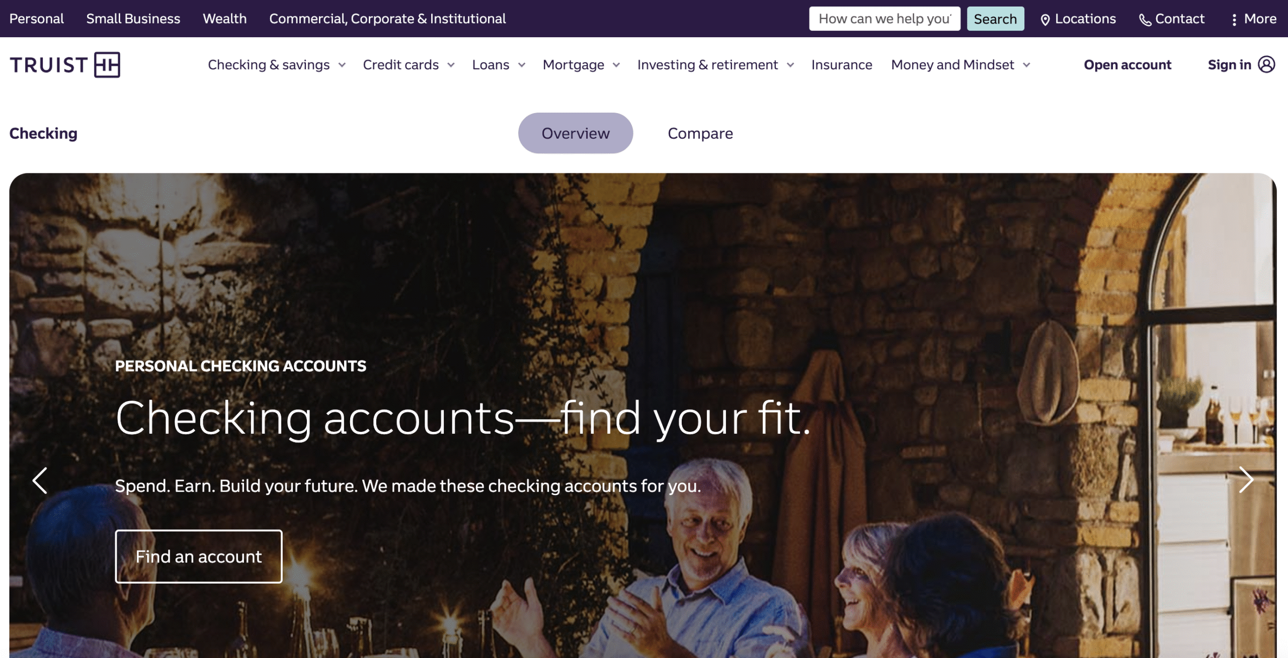 Truist Product Landing Page (top/partial view)
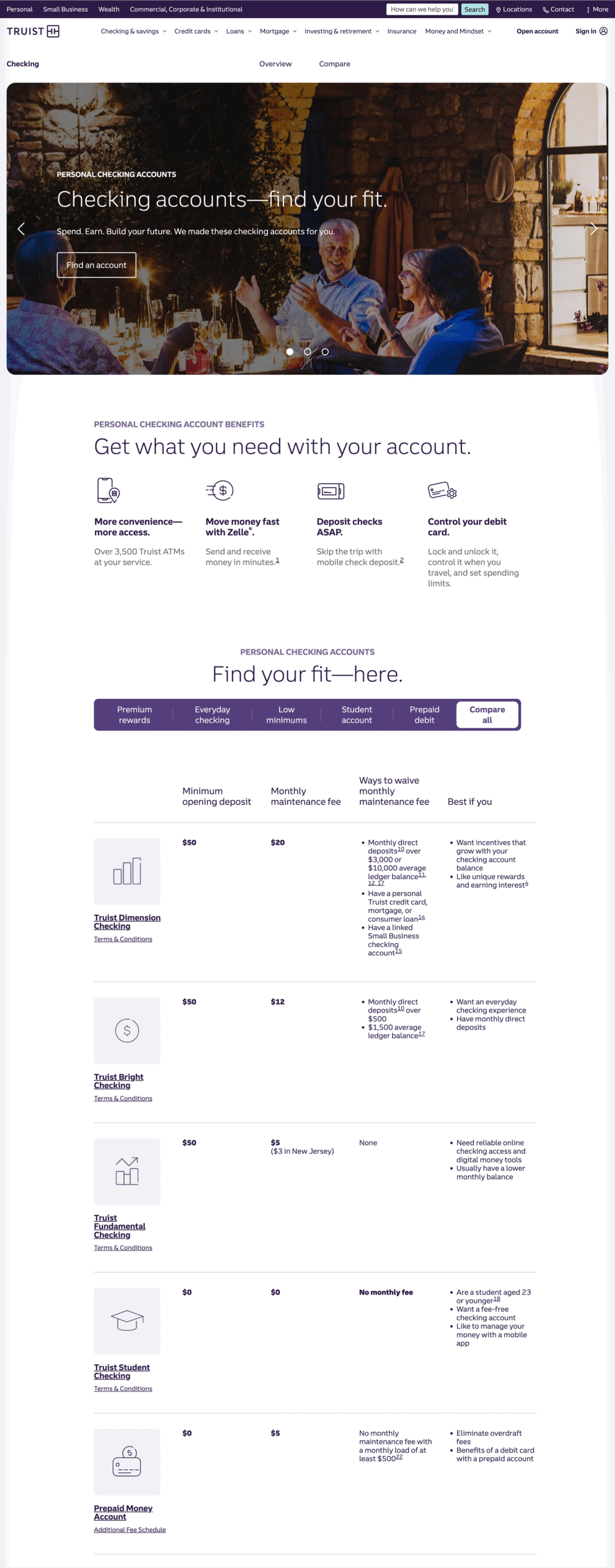 Complete view of Truist Product Page