05 Jul Leading a team to a brand new brand in 18 months


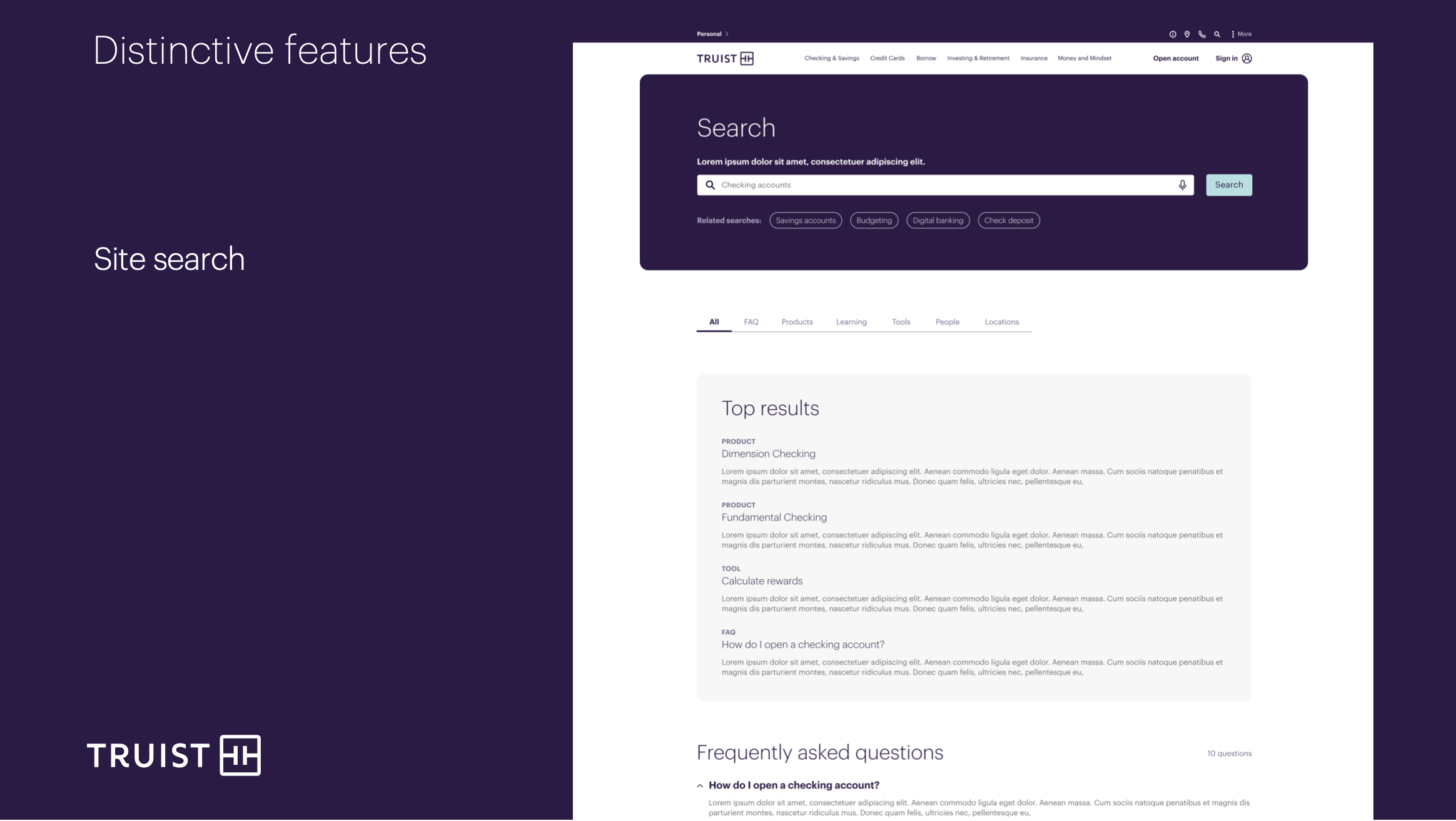
Search
Less pervasive, yet also a powerful new feature, the site’s new Search delivered far more value to visitors than prior legacy sites Searches. The new Search delivered results in sets that were easily recogni
zable and filterable according to category types.
 Search screen
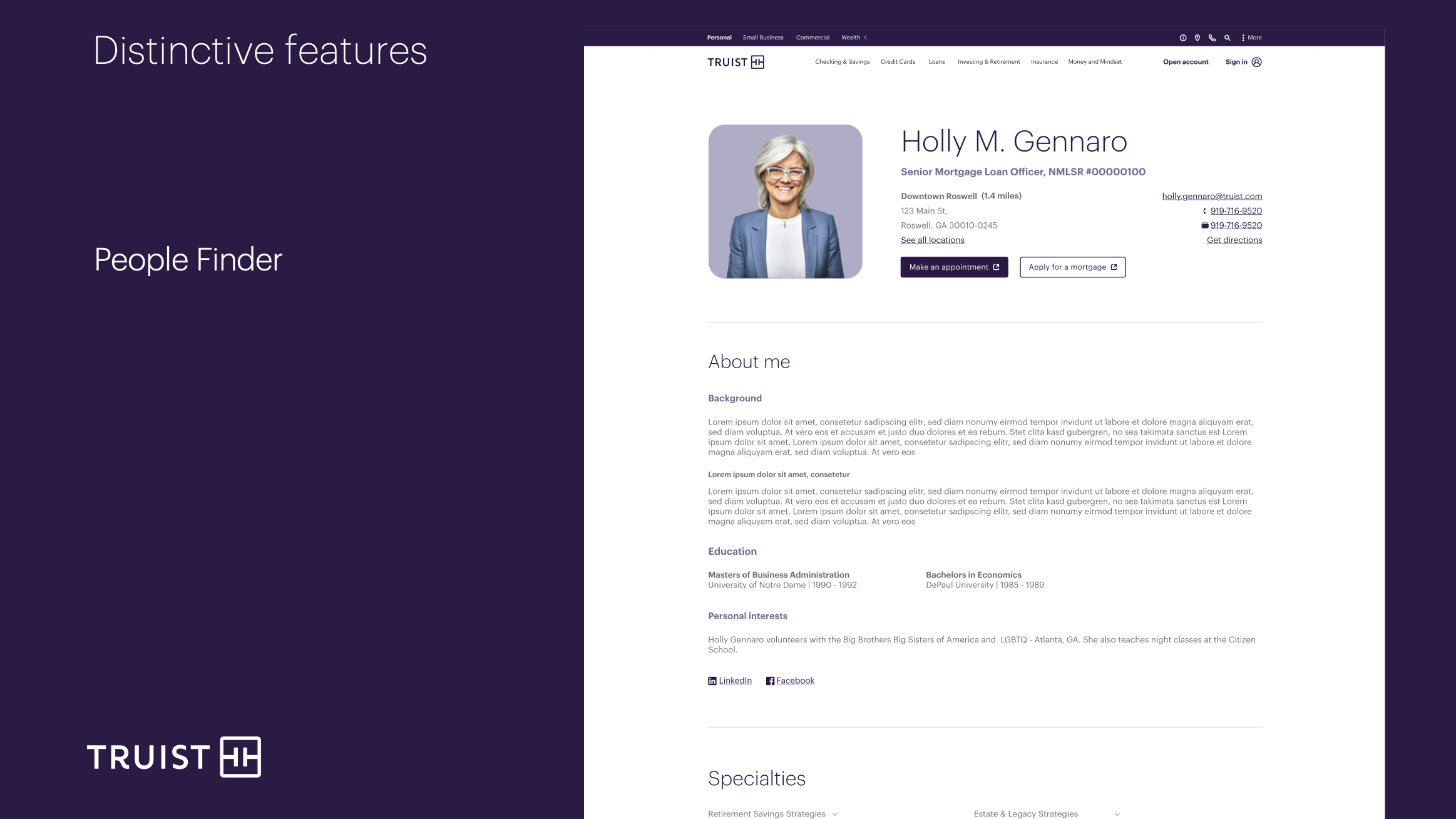
People Finder
Another feature was the first, integrated People Finder for Truist. On the legacy sites, visitors were required to navigate to a specific bank organization (Mortgage, Small Business, Investments, for example) and could then, possibly, find a mechanism for locating their bankers or branch associates. On the Truist.com site, all bankers, across business lines, were accessible via an integrated database. Users could find contacts with much more ease than before.
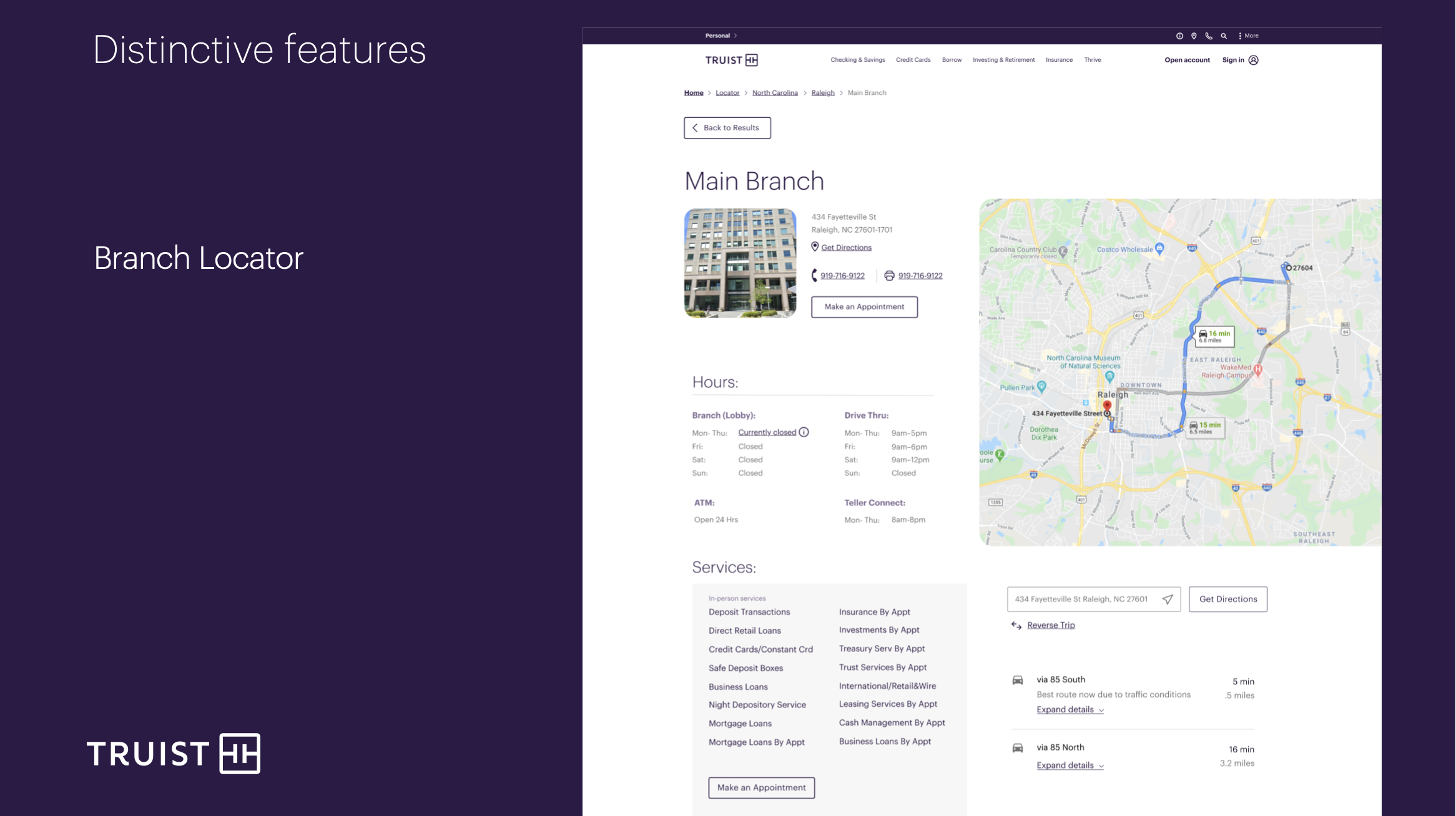
Branch Locator
The Truist.com Branch Locator had many more features than the prior SunTrust and BB&T Branch Locator versions.The Truist Branch Locator was designed to show location via GPS/Map integration as well as each branch’s associates and ability to see their corresponding office hours (linked into the People Finder).